For this project I created marketing assets and branding content for George Washington University's Kappa Kappa Gamma. As part of their marketing campaign KKG was looking for graphics and logo revamps for their social media account. I provided illustration, graphic design, and branding. I also delivered logos, graphics, banners, and composites.
Research
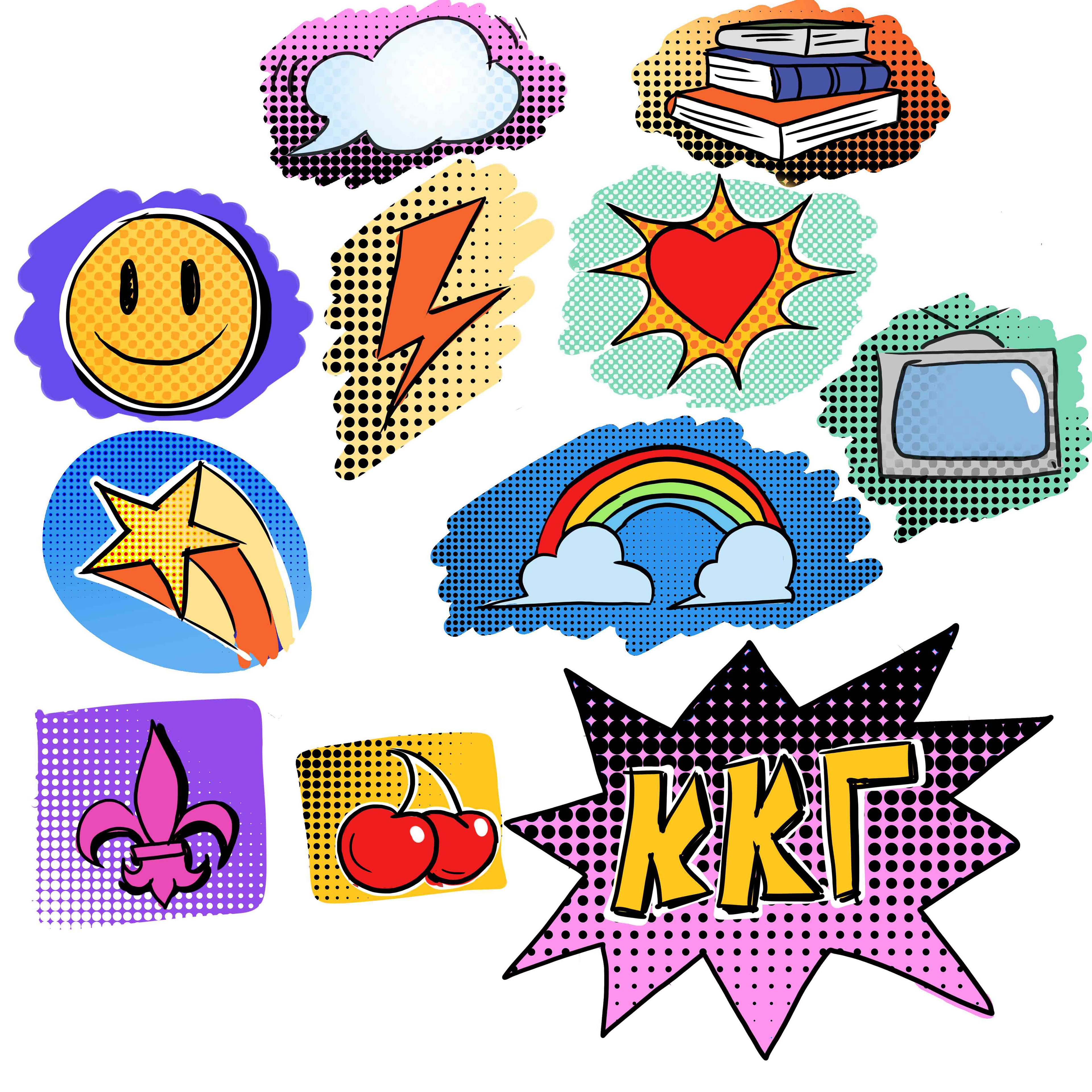
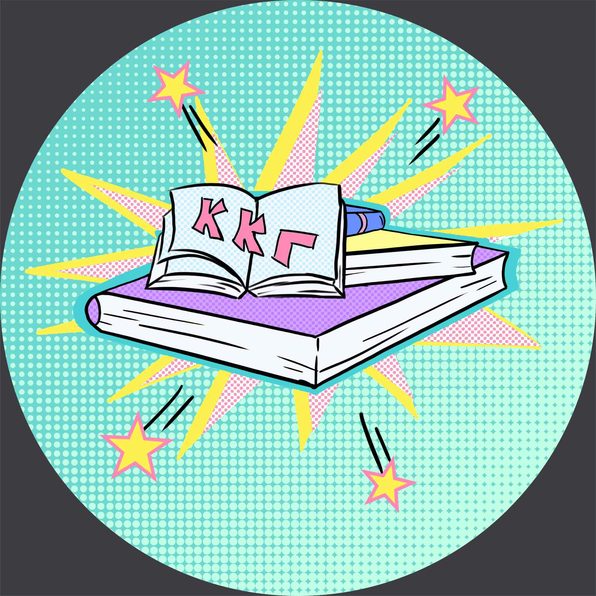
As part of the initial research I brainstorm a few sketches based on the client's brief. I was tasked with various graphics simultaneously, often delivering more than one at a time. First off was the logos, these were going to be used as cover images for KKG's Instagram Highlights.
I began with simple sketches with flat coloring and rough texturing. These very basic concepts were the groundwork for the more detailed logos later on. The final product with a total of 12 graphics.
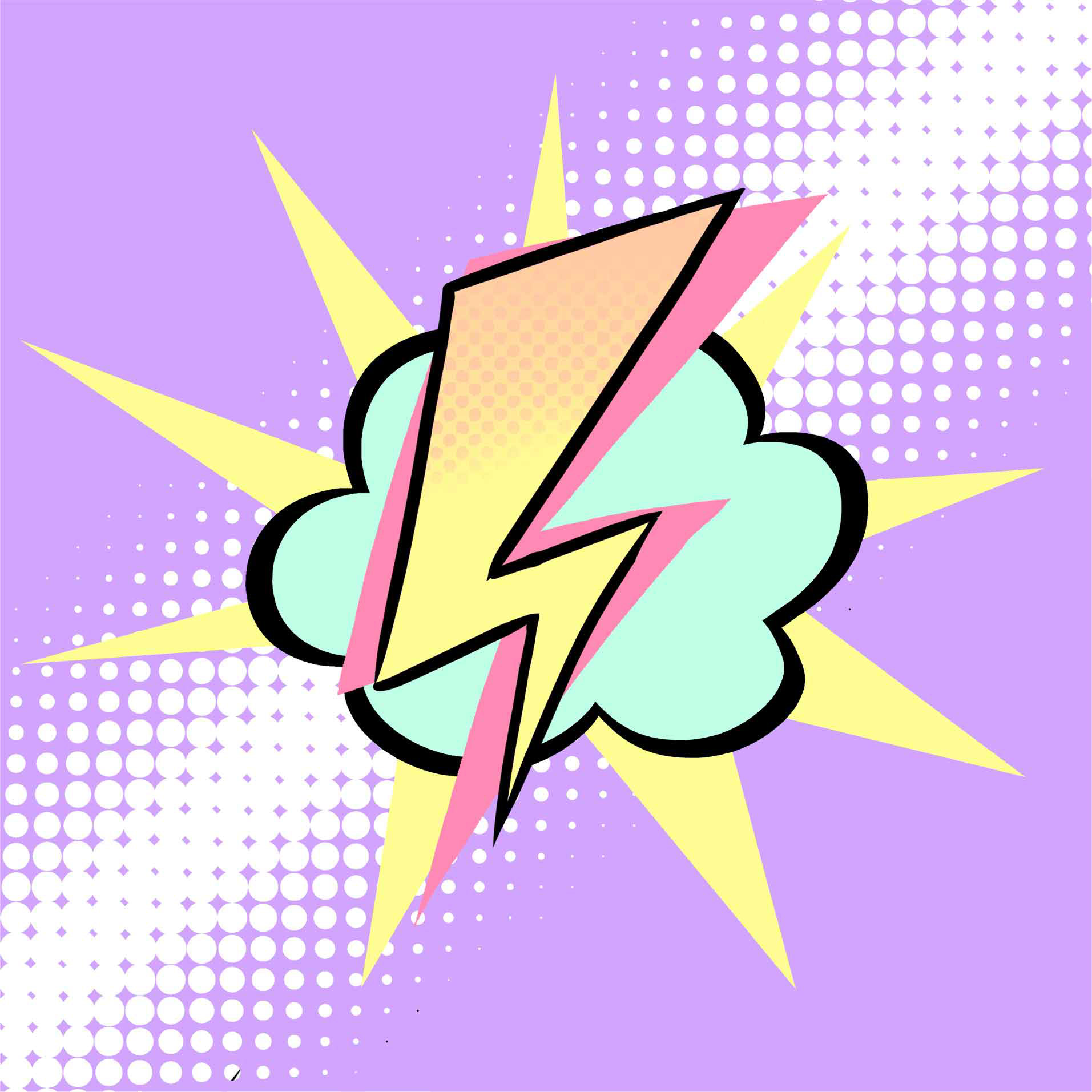
Part of the brief specified the art style for the graphics as well as the overall aesthetic. As such, a comic book art style with a pastel color scheme. This would involve high contrast imaging with very subtle swatches. In order to better depict the comic book aesthetic I decided to look into comic books as a reference.
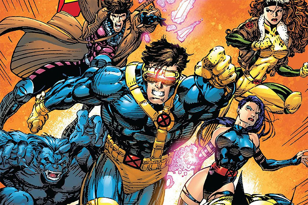
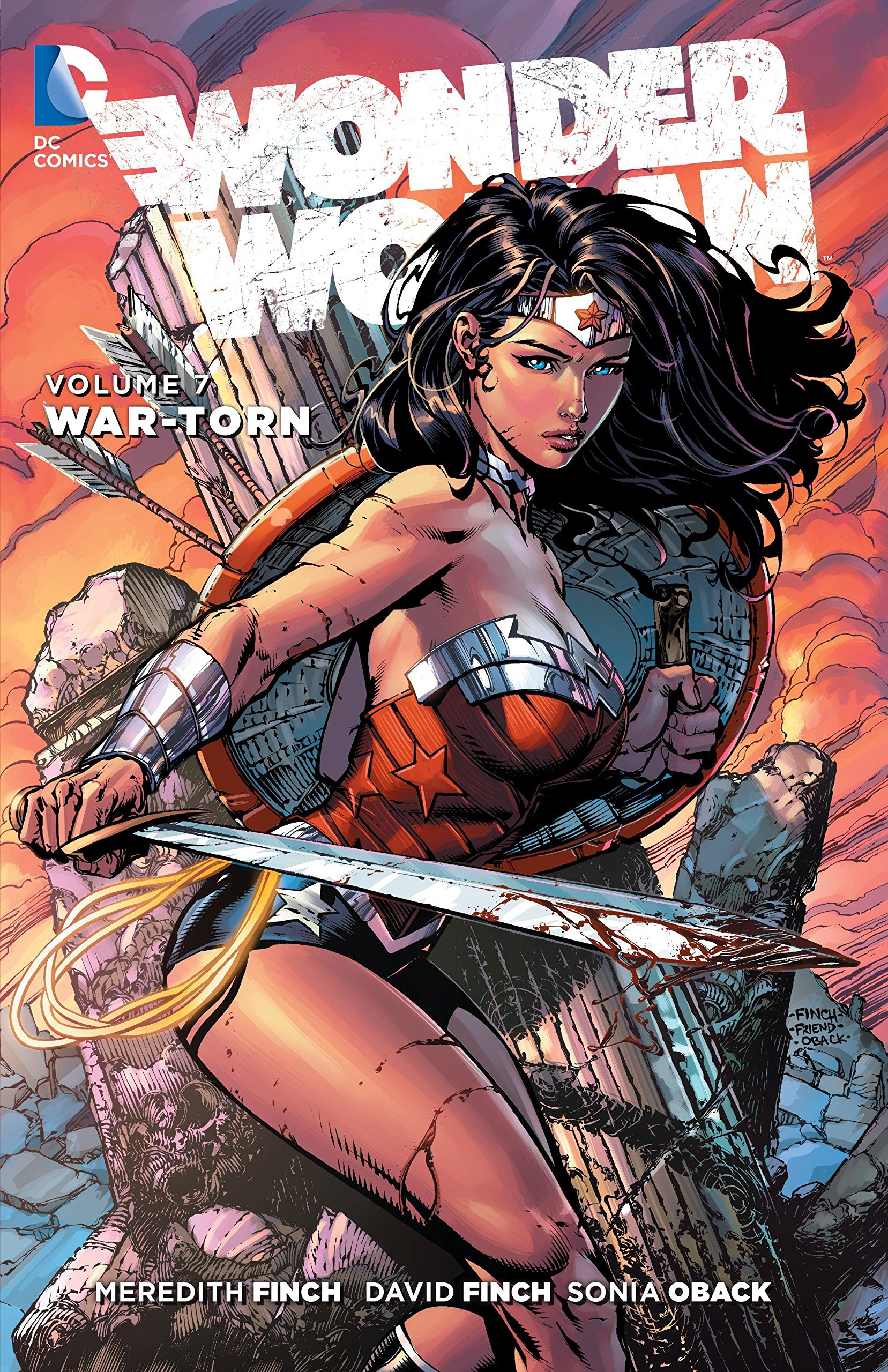
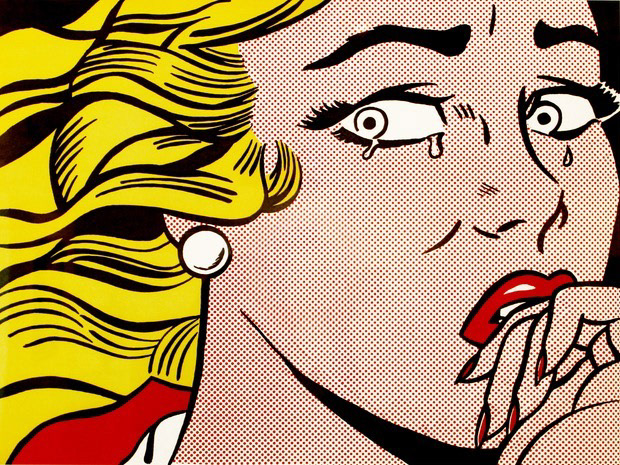
I used references from the works of Greg Capullo and David Finch, paying particular attention to the use of color and contrast.
Depicted above are samples of the comic books I used for research. Looking through these one can see the different styles present within the comic book art style, giving me plenty of elements to draw from.
Rough Drafts
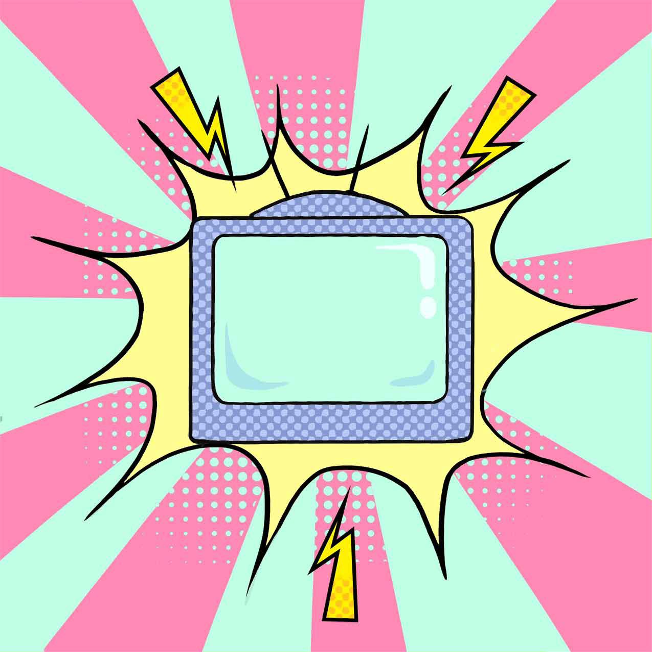
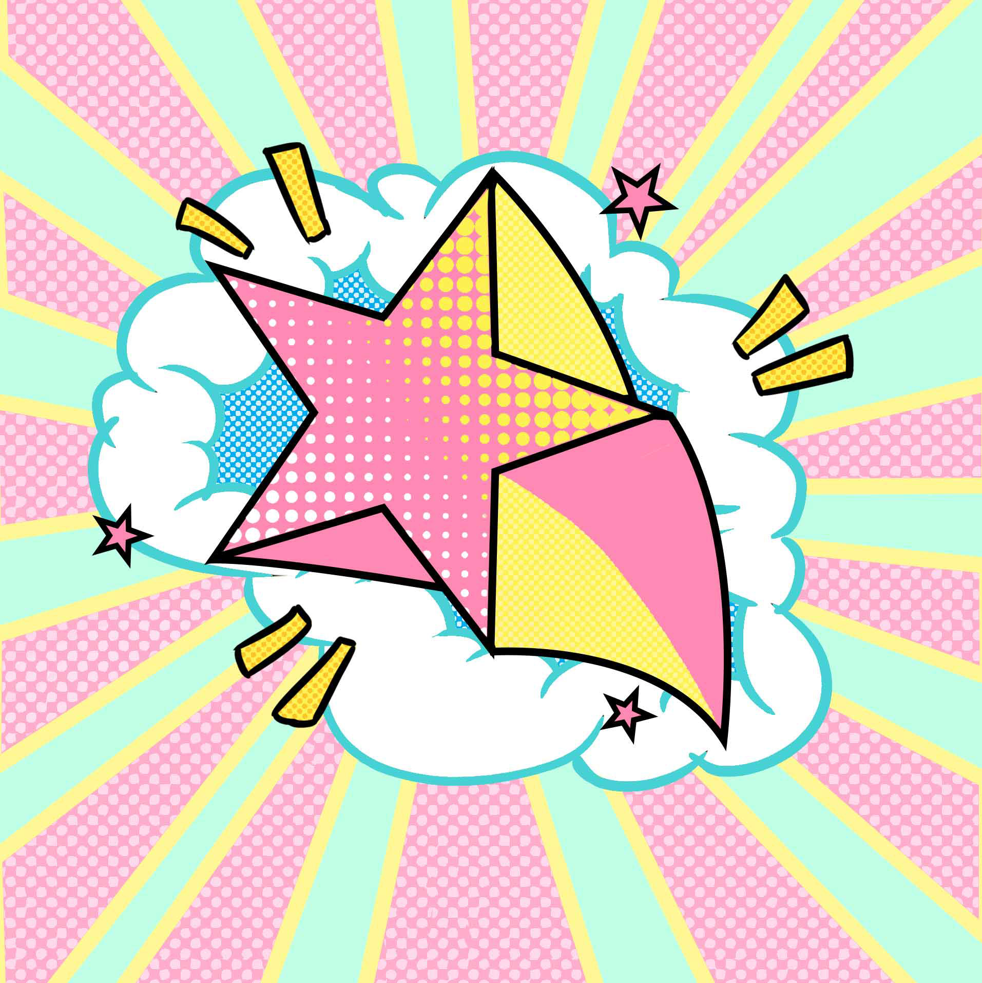
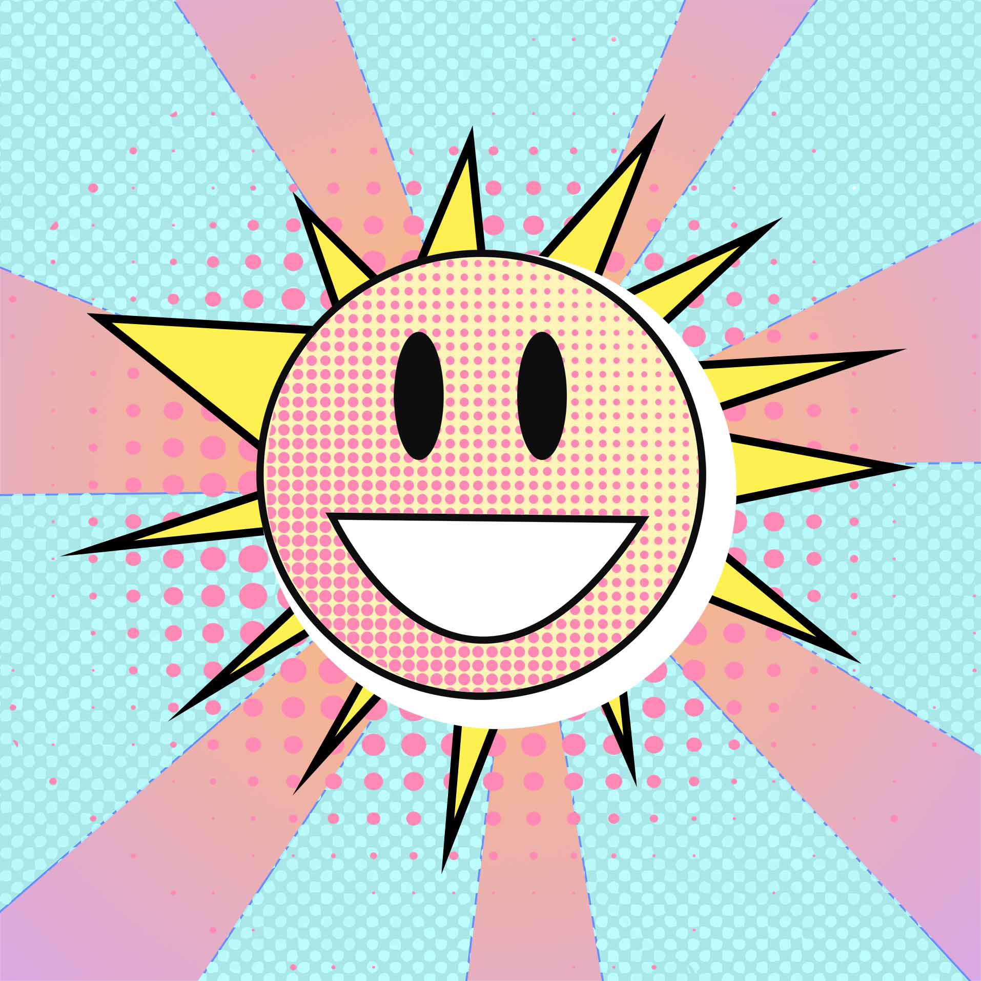
These logos were used for the Lifestyle and Wellness highlights. The client was looking for a comic book art style, with bright and high contrasting colors but with a pastel palette.
This came with some complications; usually, in this type of style, there is a strong use of saturated colors. In order to work around this I used a halftone texture to compensate for the lack of saturation.
Banners
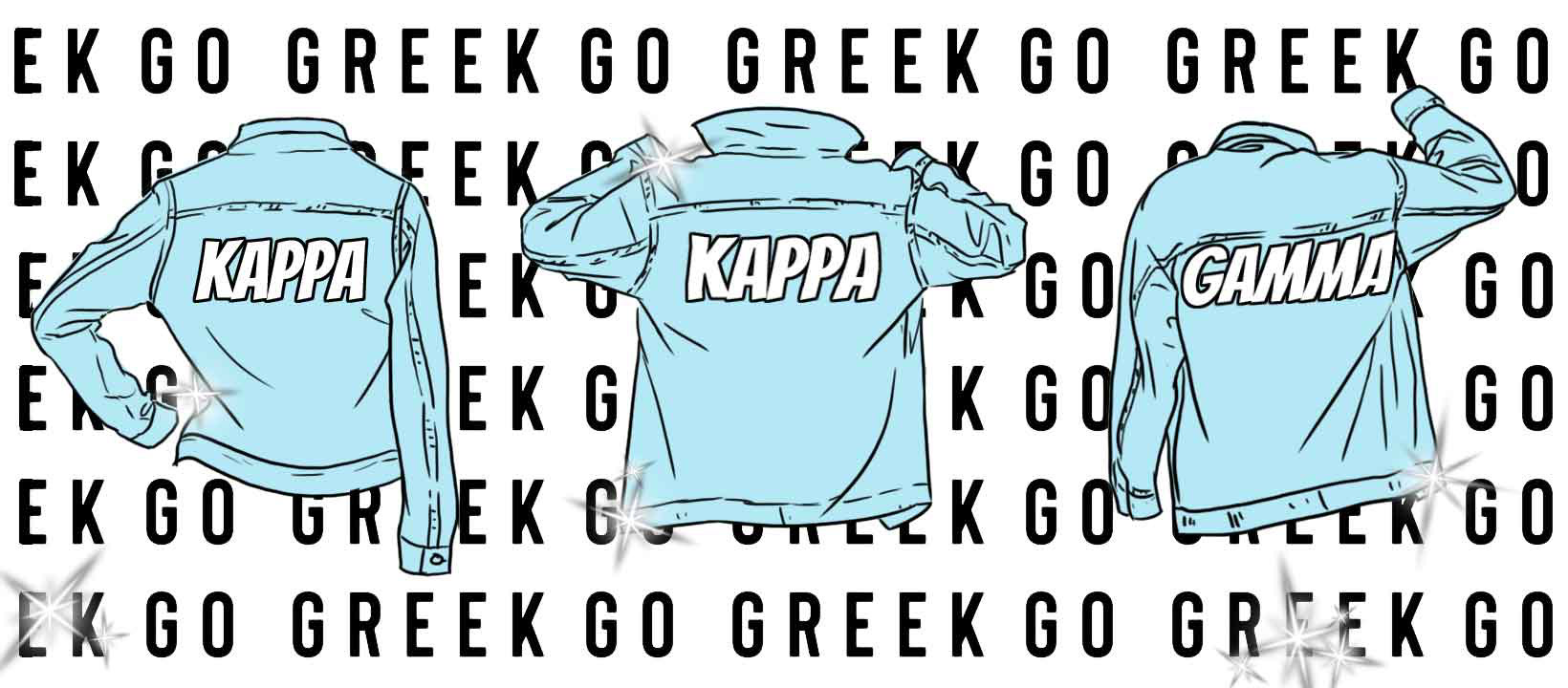
Depicted bellow is a rough draft of a banner used for posters and pamphlet covers. Still using a pastel color scheme and a comic/cartoon style. This came with a short brief: a banner with the words "Go Greek" and denim jackets.
By using the words as a repeated pattern I was able to give a sense of depth for the denim jackets, which themselves have the sorority's Greek name. Sparkles were added as per request by the client.
Marketing Assets
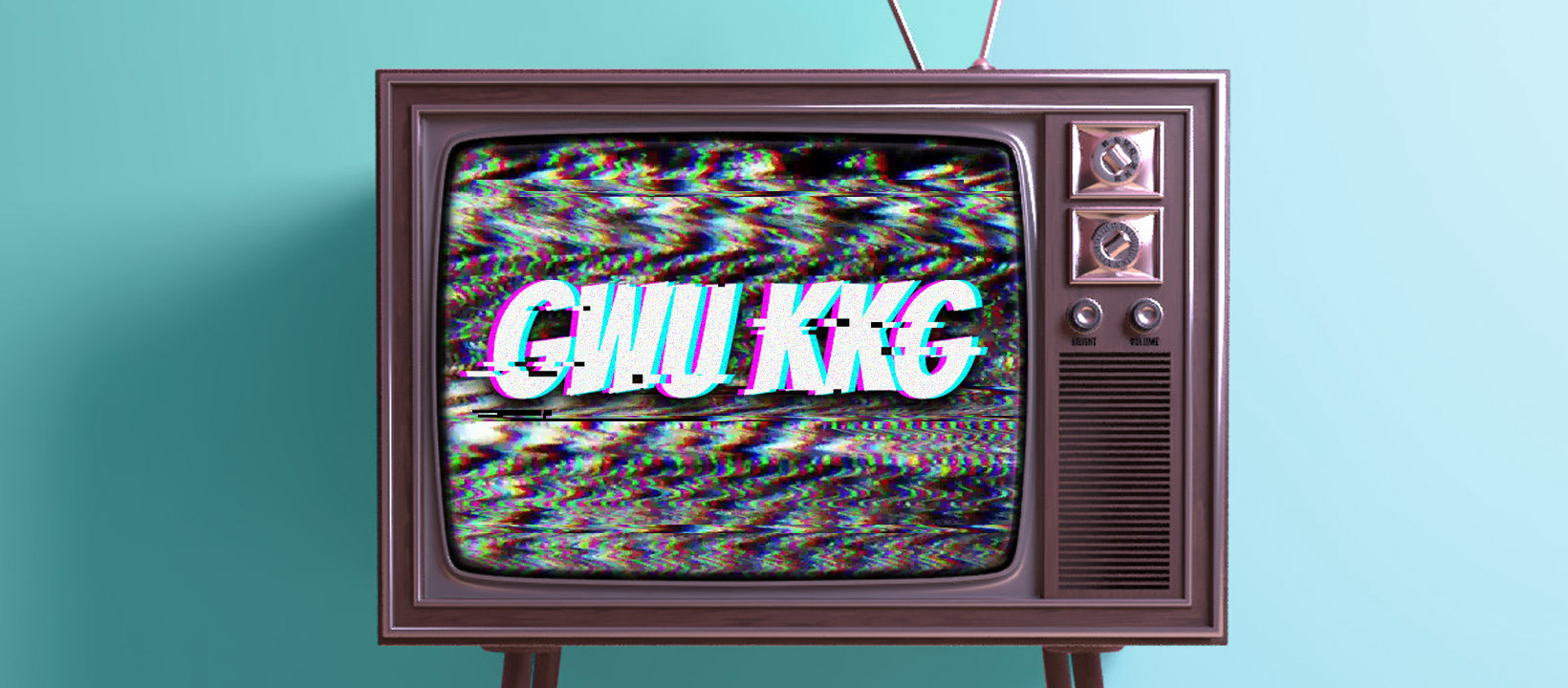
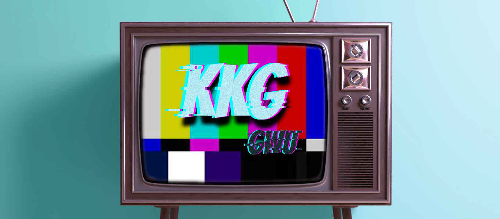
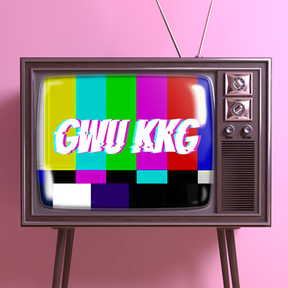
This was another part of the project, probably the most fun set of assets to work on. Depicted are samples of different composites for the news feed. These visualize a retro feel with a glitch effect on both the tv static and the Greek letters. Noise was also added on the lettering, with a slight blur for that extra retro effect.
With the revamp the logos I was able to create a brand identity that was uniquely designed for KKG. Showcasing aesthetics that made for a fun and original design.