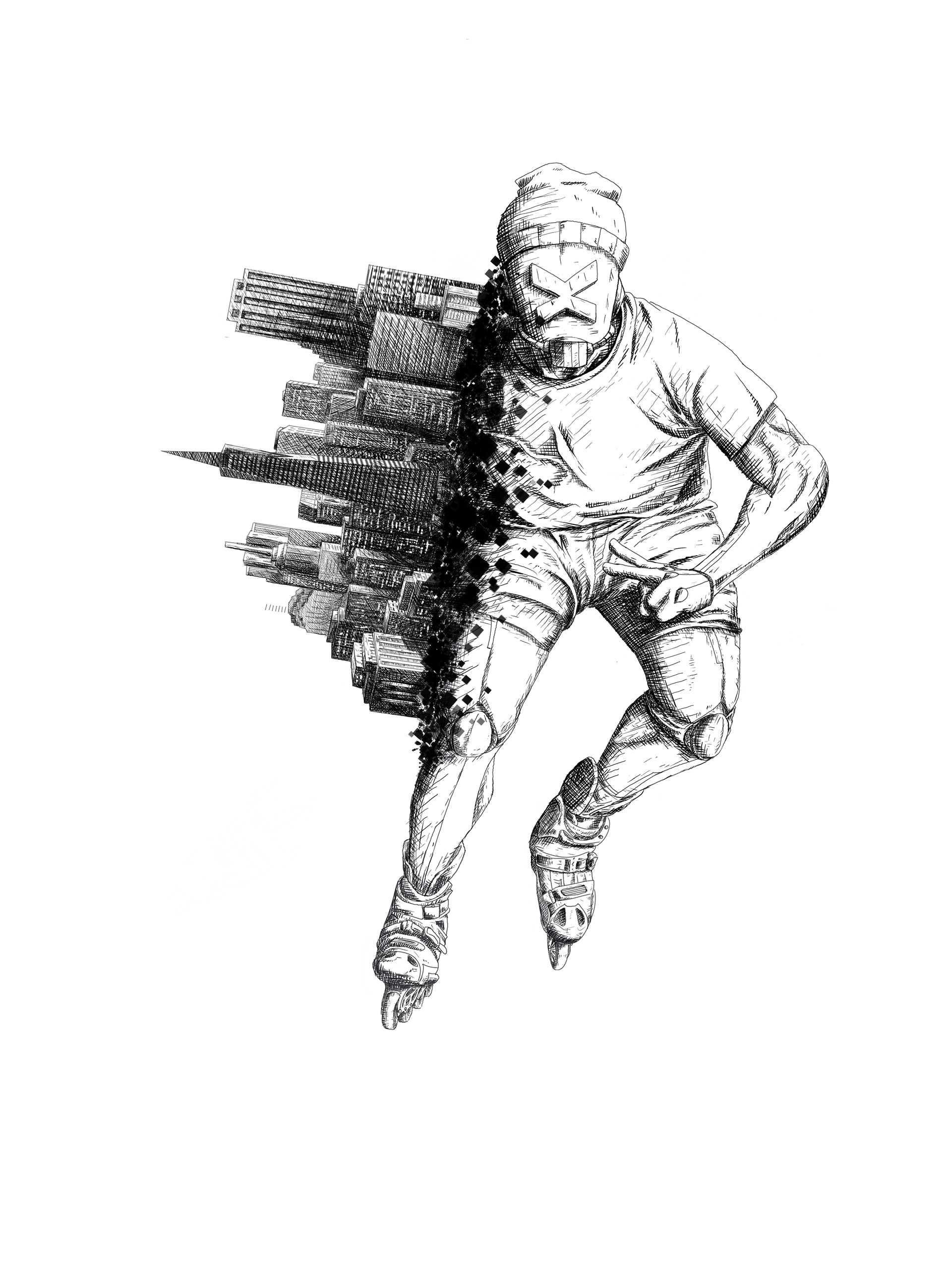

For this project I designed a series of print graphics, with the motif of a robot on rollerblades melding with an urban landscape. The graphics were used for Shreddbot's Fall collection of 2019, War with Gravity, with a total of two full graphics and logo variations.
RESEARCH
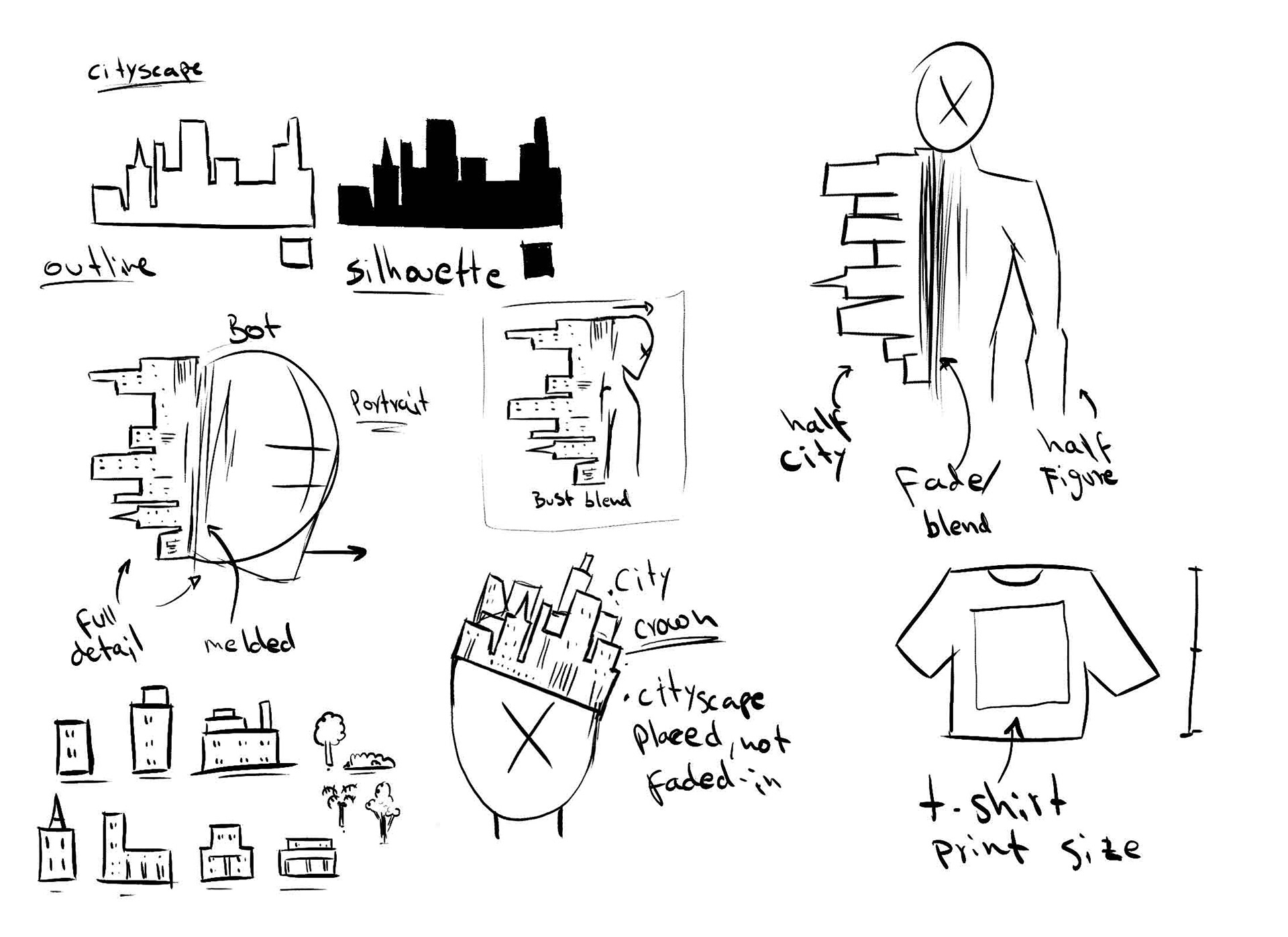
Thumbnails and sketches.
I began to brainstorm the concept with very loose sketches. In order to better visualize the concept an urban landscape I decided to play with the idea of a cityscape, particularly the silhouette of skyscrapers.
This way I could make a stark contrast between the figure and the landscape it's meant to meld with. Using strong elements like shape, size, and value I could then create a composition that not only caught the viewer's eye, but also flowed with the concept.
In order to stay in-brand I decided to make a mood-board. This would include elements of skater culture, streetwear, and use of urban architecture. Ideally, the skating robot depicted on the graphics should appear relatable to the audience.
I used several references for poses and tricks, some of which included a close up of rollerblades. It was important to base my designs on imagery of actual skaters in the act of skating, adding some authenticity and realism to the graphics.

Moodboard

First rough drafts.
With a proper basis for my design, It was time to develop the concept. Some ideas from the initial sketches were used here. For instance, the half-figure half-cityscape and the city crown, the latter which still played with the concept of figure and urban setting.
I also included the first drafts of the four logos, these would be printed on smaller items such as hats and beanies.
FIRST DRAFTS
For the first rough drafts I used references of some of the most popular tricks in the skating culture, allowing for more dynamic compositions. I then used the negative space left by the figure and aligned the cityscape with the direction of the potential momentum. By doing this the graphic would have a flowing composition with a smooth transition between the figure and the cityscape. Basically, the cityscape points in then opposite direction relative to the figure.
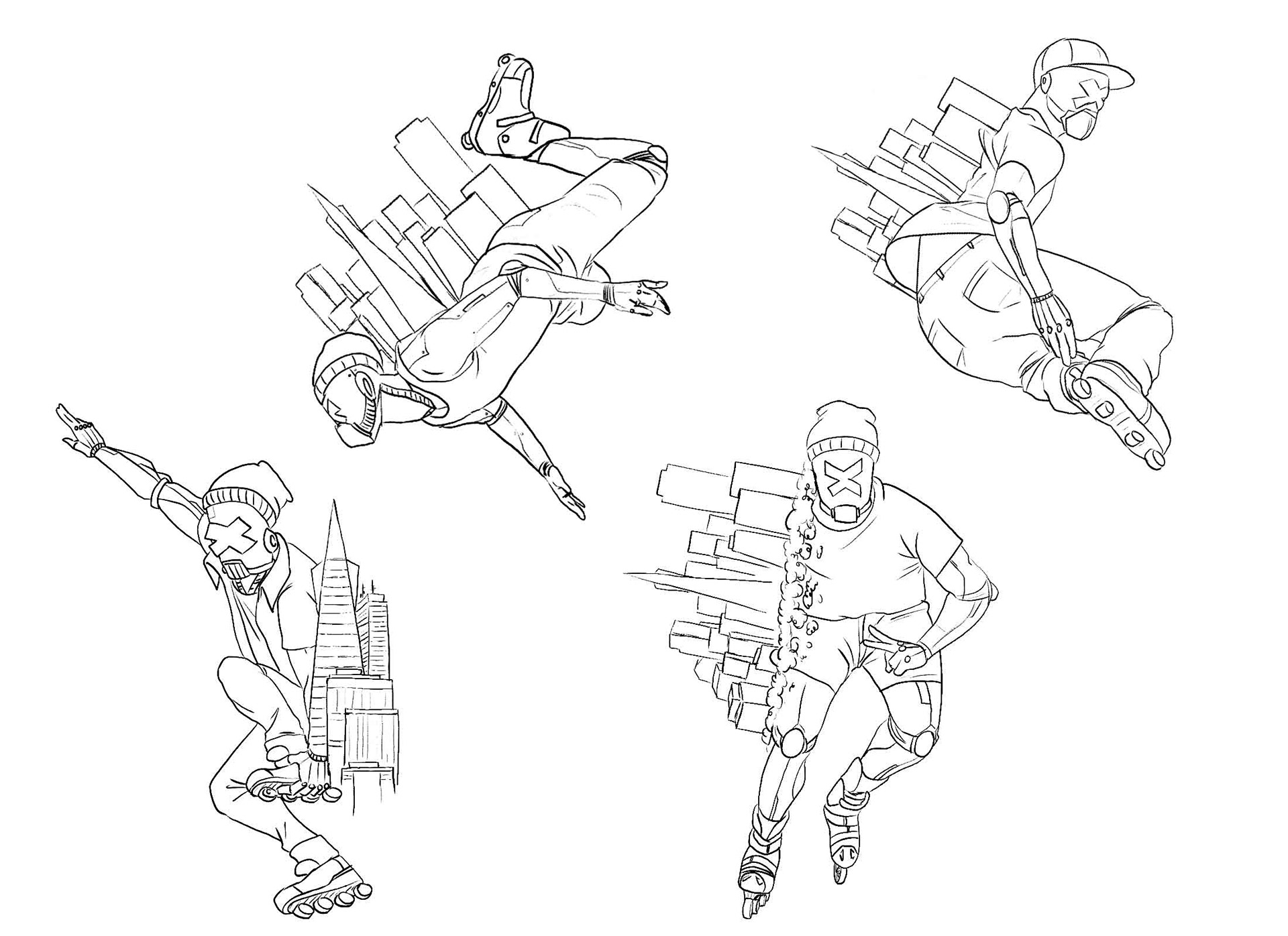
First rough drafts.
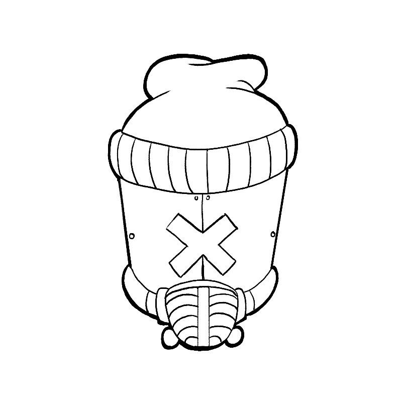
Depicted on the right is the sketches made for the logo. The concept is similar to the graphics, except only the head is featured. The logo would not only represent the skater robot, it would serve as the icon printed in all marketing graphics.
I made eight rough drafts, each with a different design and visual concept. It was important to personify the robot and design it as the average skater, this is why clothing items were included. Although the "x" sign over the face of the robot was requested by the client, it still did not read mechanical enough. Thus, a gasmask with tubes coupled with tiny circles to signify bolts was then used to further illustrate a mechanical texture.

Rough drafts for logos.
Similarly to the full graphics, the logo was also shaded in a cross-hatch technique. A version without shading was also included in the final production. This facilitates the printing of the logo in a smaller items.
Logo, flat version.

Logo, shaded version.
FINAL PRODUCT
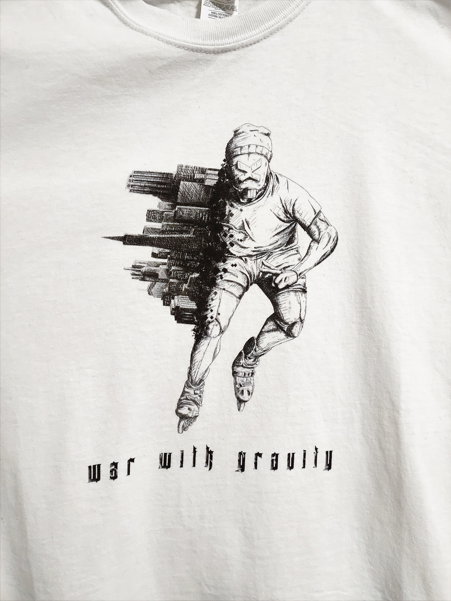
Website thumbnail (Close-up).
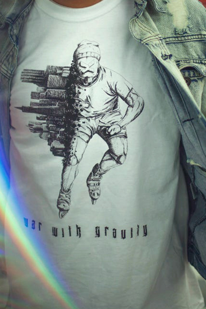
Photoshoot for Shreddbot.
This was a really fun project to be part of. The designs came out solid, the prints were crisp and eye catching, and the collection as a whole was very popular.