Calaveras Tattoo & Piercing
This project is a redesign of an existing website from a local business. The idea was to rebrand and revamp with a more modern design. I designed a new UX/UI, repurposed old assets, improved the layout, and redesigned the logo.
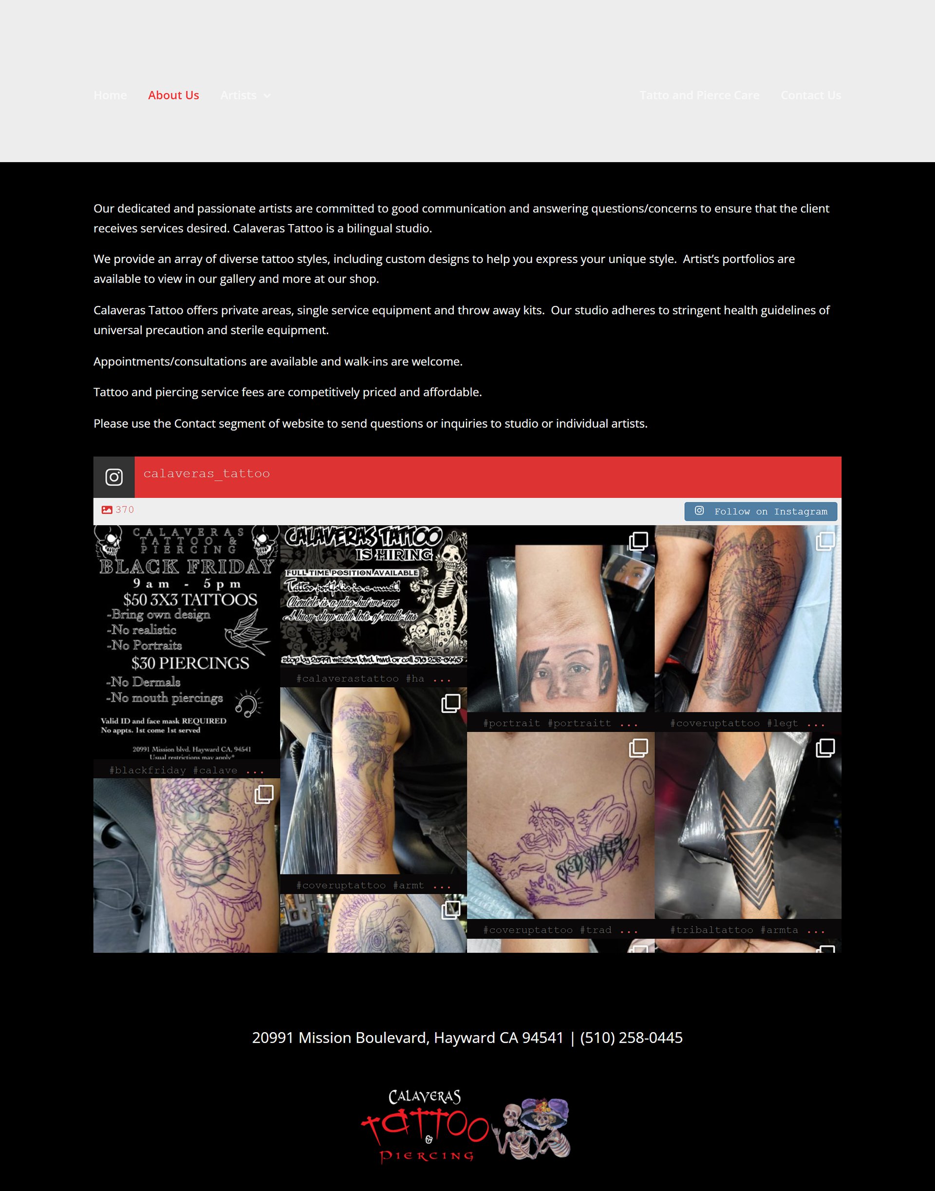
About page
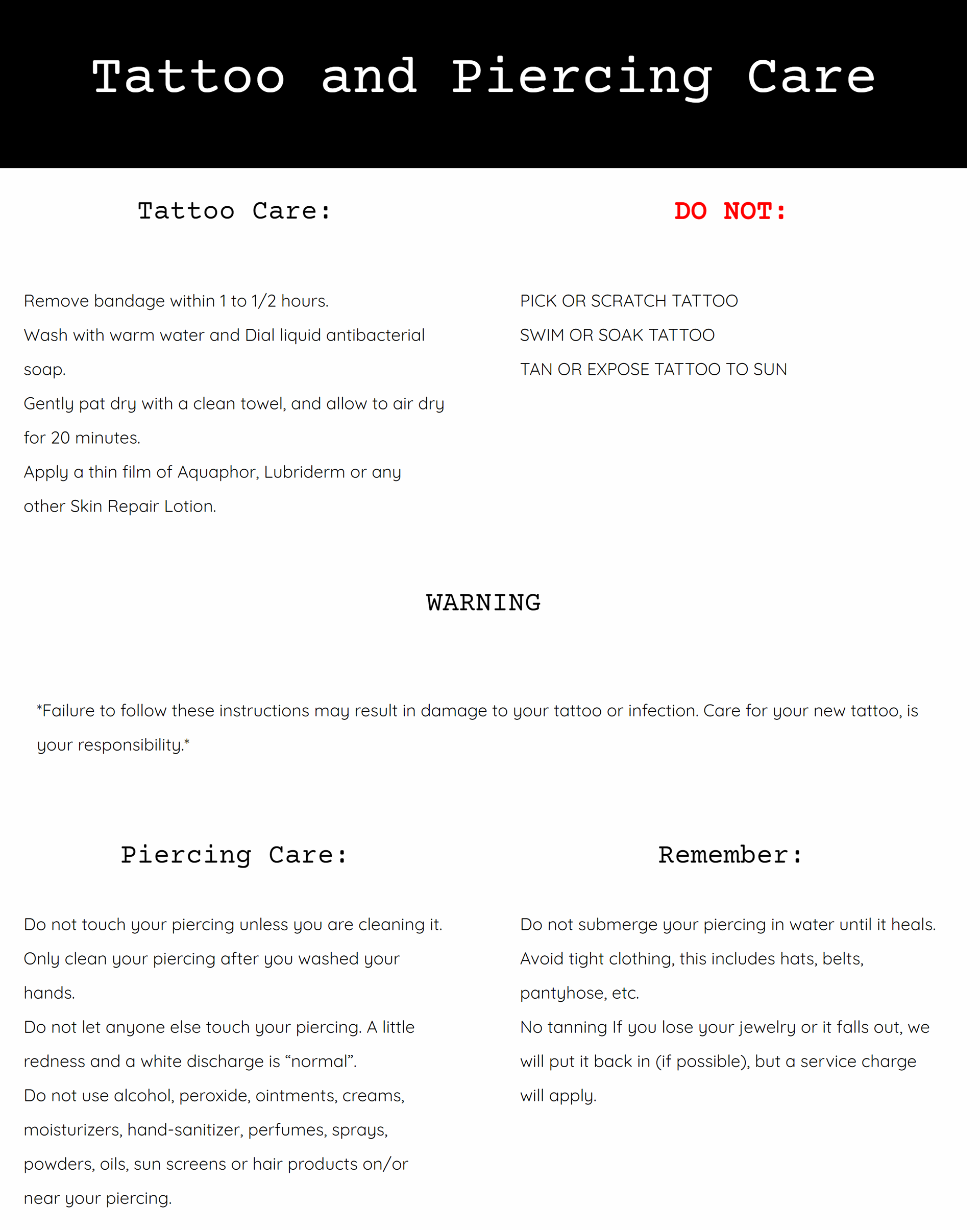
The original website had a few design decisions that didn't favor the overall aesthetic. It consisted of big paragraphs, loosely bound grids, a blurry logo, and a black background. It was not short on imagery but lacked a cohesive layout, not to mention the black background diminished much of the design to the point that some elements were not easily visible.
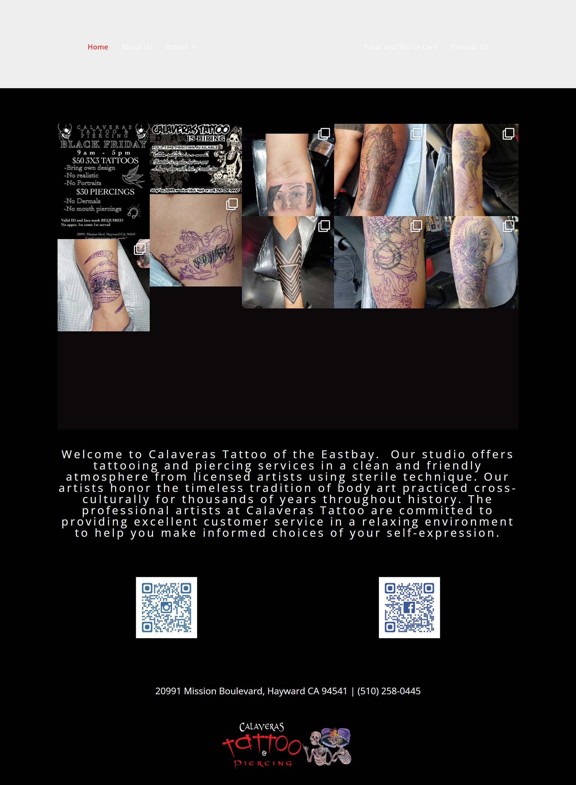
Landing page
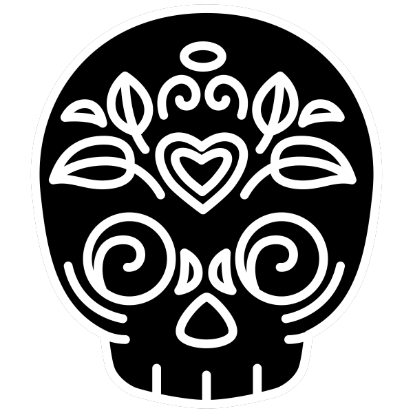
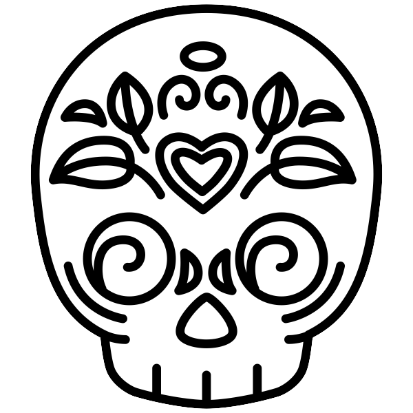
The original logo, although quirky, had a low resolution making it hard to read. Not to mention the color scheme did not match the overall aesthetic of the website.
With the new logo I planned to have a more simplified design. I went for a more minimalist style with a neutral black/white color scheme. A sugar skull was still used as the logo in order to maintain the shop's brand identity, but a cleaner design allowed for a more recognizable graphic.
These also function as navigation; when scrolled to the bottom of the page, licking on the logo takes the user back to the top. Also, when on a separate page, like the artist's gallery, the logo links back to the home page.
After some A/B testing it became clear that having a long-scrolling website had a better conversion rate than the original design. It was also much easier to use in the mobile version; since it involved less clicking the user could then scroll and view the entirety of the page with a few "flicks".
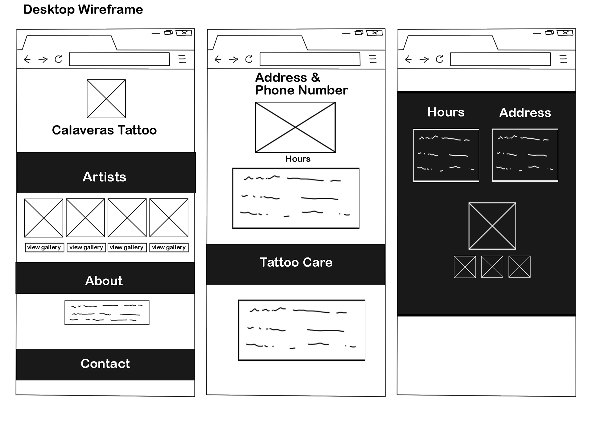
Contents in the website, and the manner in which the client wanted them to be presented, called for a defined structure. Banners were then used to help frame sections within the page. A color scheme of black/white was used in the wireframes for simplicity.

Typography
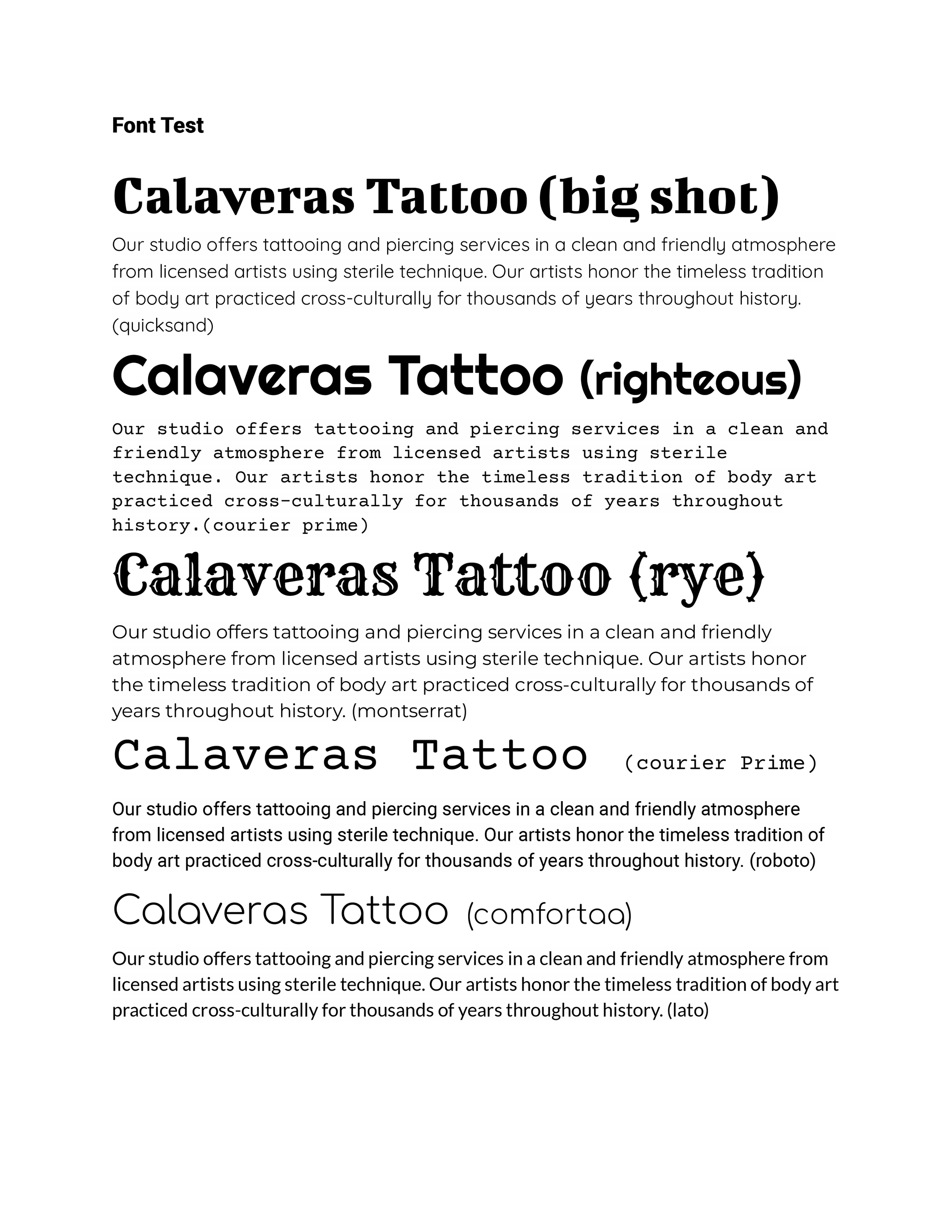
Choosing a font was tricky as it would influence the overall style of the website, and by extension the tattoo shop. To keep it simple I explored different variations with only headline and paragraph fonts. I used Google Fonts because it offered the cleanest font options.
I made several combinations, switching out different fonts for the paragraphs and the headlines. Keeping only the display fonts for the headlines, and the serif/san-serif fonts for the paragraphs.
A prototype was promptly developed with fonts and graphics already included. Sticking to the minimalist style allowed for high contrast. Some minor details were added, and formatting was slightly altered. Color scheme stayed the same as the wireframe, with a placeholder for embedded elements.
Prototype
mobile version
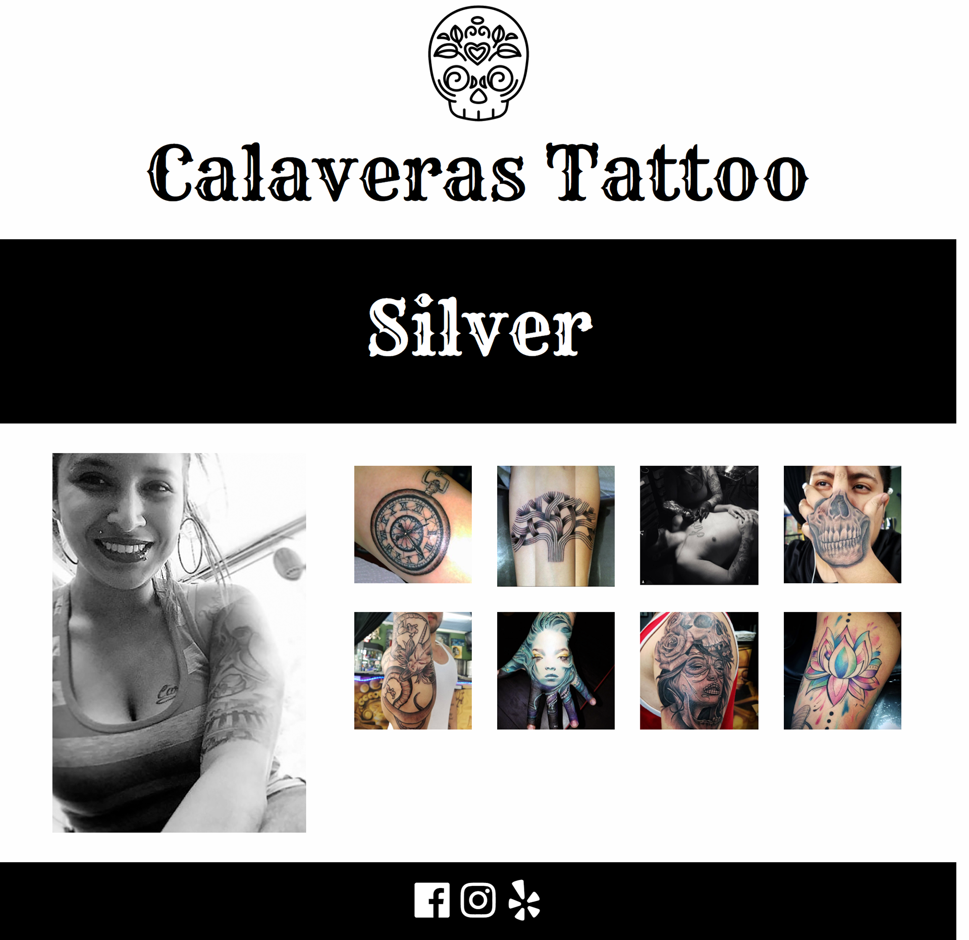
artist's page
The only pages outside of the long-scrolling layout are the artist's galleries. These link to a separate page for each artist, showcasing their portfolio and their profile picture. Each following the same layout rules. This was done so that each artist would have it's own space to fill up with their work.
Additionally, this would help keep the structure of the website intact. Earlier sketches included a drop-down menu for each artist's gallery, however, this obstructed the layout as it made for a longer scrolling rate.